
Firstly, the masthead of this magazine cover is
the 2nd biggest feature on this page and takes up the whole width of
the top ¼ of the page. It is a golden sand colour to compromise the background
of the sea/beach. The typeface of the masthead is the same on every issue of
this magazine, making it recognisable and a branding/logo of the magazine. Also,
the dateline is just below the E, very small font but we can still identify it
due to its position under the masthead. The main image is the biggest feature
on the magazine cover. It stands out compared to anything else on the page,
especially due to Rihanna’s red hair. Rihanna is making full eye contact. This
is a technique that magazines use to draw the audience in. The cover has many
coverlines, the main one being ‘Worlds most beautiful bodies’. This makes the
audience, especially women as this magazine is target it women, want to read it
as some women feel the need to have a body like celebrity to be seen as
attractive. Rihanna is known to have an attractive body so this acts as an
incentive for the readers. The magazine cover is split into thirds
horizontally. The first third is cover lines; the second the main image, and
the third part is cover lines again.
This is good because it doesn’t draw the attention away from the main image but
the cover lines are still noticeable. The coverlines are all related to the
main coverline, which is about body image. The other coverlines (puffs) are
also about body image and being healthy. For example, ‘Fashion to
flatter every figure’ and ‘eat yourself happy’.
 The second magazine I am analyzing is ELLE
magazine, which is similar to vogue but maybe slightly lower on the social
economic model prior to it look less sophisticated than Vogue. The layout of
the magazine is very similar though. The masthead is large and at the top of
the page catching the readers eye. The colour of it matches the colour scheme
of the page. It is the same on every issue of this magazine so it acts as a
logo/branding for the magazine making it recognisable. The main image is the
feature, which draws the reader in as it is the biggest feature of the cover
and Jennifer Aniston is making full eye contact. Her body language is very
feminine especially as her hair has been made to ‘blow in the wind’. She is
dressed very sophisticated. Jennifer Aniston is known to be sophisticated, this
can be due to her age. Her head is in the centre of the page, in between the two 'LL'. This makes it the first thing the reader notices along with the mast head. The main coverline is 'Jennifer'. This is a link to the main image as the image is of Jennifer Aniston. The other coverlines(puffs) are female related as the magazine is targeted at females. For example, 'clear skin now' and '100 boots, heels and flats'. The magazine has a colour scheme. It is shades of grey, and black on a white background. This gives it a sophisticated look.
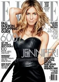
The second magazine I am analyzing is ELLE
magazine, which is similar to vogue but maybe slightly lower on the social
economic model prior to it look less sophisticated than Vogue. The layout of
the magazine is very similar though. The masthead is large and at the top of
the page catching the readers eye. The colour of it matches the colour scheme
of the page. It is the same on every issue of this magazine so it acts as a
logo/branding for the magazine making it recognisable. The main image is the
feature, which draws the reader in as it is the biggest feature of the cover
and Jennifer Aniston is making full eye contact. Her body language is very
feminine especially as her hair has been made to ‘blow in the wind’. She is
dressed very sophisticated. Jennifer Aniston is known to be sophisticated, this
can be due to her age. Her head is in the centre of the page, in between the two 'LL'. This makes it the first thing the reader notices along with the mast head. The main coverline is 'Jennifer'. This is a link to the main image as the image is of Jennifer Aniston. The other coverlines(puffs) are female related as the magazine is targeted at females. For example, 'clear skin now' and '100 boots, heels and flats'. The magazine has a colour scheme. It is shades of grey, and black on a white background. This gives it a sophisticated look.
The final magazine I have chosen to analyse is GQ, which is a mens fashion magazine. The mast head is in the top left hand corner. It is an appropriate size so that the reader can see it. It is in a boyish and bold font. The main image is the largest feature on the magazine cover. Channing Tatum is making full eyecontact, drawing the reader in. He is sorting his tie out to make himself look 'smooth'. The readers will want to read his magazine to make themselves look like/be a gentleman like Channing Tatum. The main coverline is 'Man of the Year'. It is in bold font. All the coverlines(puffs) are in the same font. This makes it look tidy and neat and also sophisticated. The main colours used are grey, yellow, black and white.
No comments:
Post a Comment